These are screen shots of my editing for some scenes that are going to feature in my music video, these relate to goodwin's principles due to the colour and creative props that i am using in my music video, this can also be linked with katy perry or lily allen's music videos. They both have a child-like theme due to the props and bright colours but then have a clear meaning in to why they have used them.
I am really happy with my final outcome of my cd cover and back, I think my overall effect has come across as my artist being see through to show that she is a 'ghost' and is lonely.
I have decided to use san's serif as I want to make it look personal and feminine. The font high lighted in red is the font I will be using in my magazine advert and booklet for the main information I will be writing.
I put my CD cover into a real cd case to see what it looked like, here are some photos I had taken of the cd cover. I also edited them in an antique way which can be linked to my music video where I used old aged effect and film grain.
I had add more scenes after my jump cut scene as it did not fit to the length of the song I had chosen, I did this by adding more lonely scenes and my ending scene changed to the artist returning back into the dolls house, which I thought worked well as it matched with my beginning scene, it closed my music video really well. Here are some screen shots of the scenes I added to my ending.
Today I wanted to re film my beginning scene as I did not feel it was strong enough and the quality of the filming was not up to the standard of the other scenes I have filmed. I had an idea of my artist running out of the front do and then evacuating which makes more sense than her standing there in front of the door. Also filmed an intro to my scene were it will be a POV shot of the artist running out of the house and will be features before the song will start.
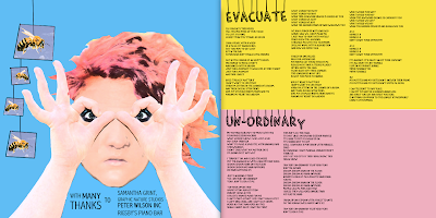
I would like to use these photographs possibly for my booklet, and I will like to make them look distorted and old looking, I will also like to put these with lyrics of the songs I have chosen to be on my track list. My idea for my booklet would be a poster, with the different lyrics and images placed around them.
The images I have taken are located in the garden, which shows my brand identity of natural colours and lighting, My artist is wearing a statement piece of clothing, to stand out in the background. I have added in the photo graphs a touch of colour where I have pictured flowers and other aspects of the garden to highlight the natural effect. This will also show the style of my artist, and relate to her creative songs. In my images I wanted my artist to give direct contact to the audience when they see my album cover as it shows it is personal as she is an unsigned artist.